

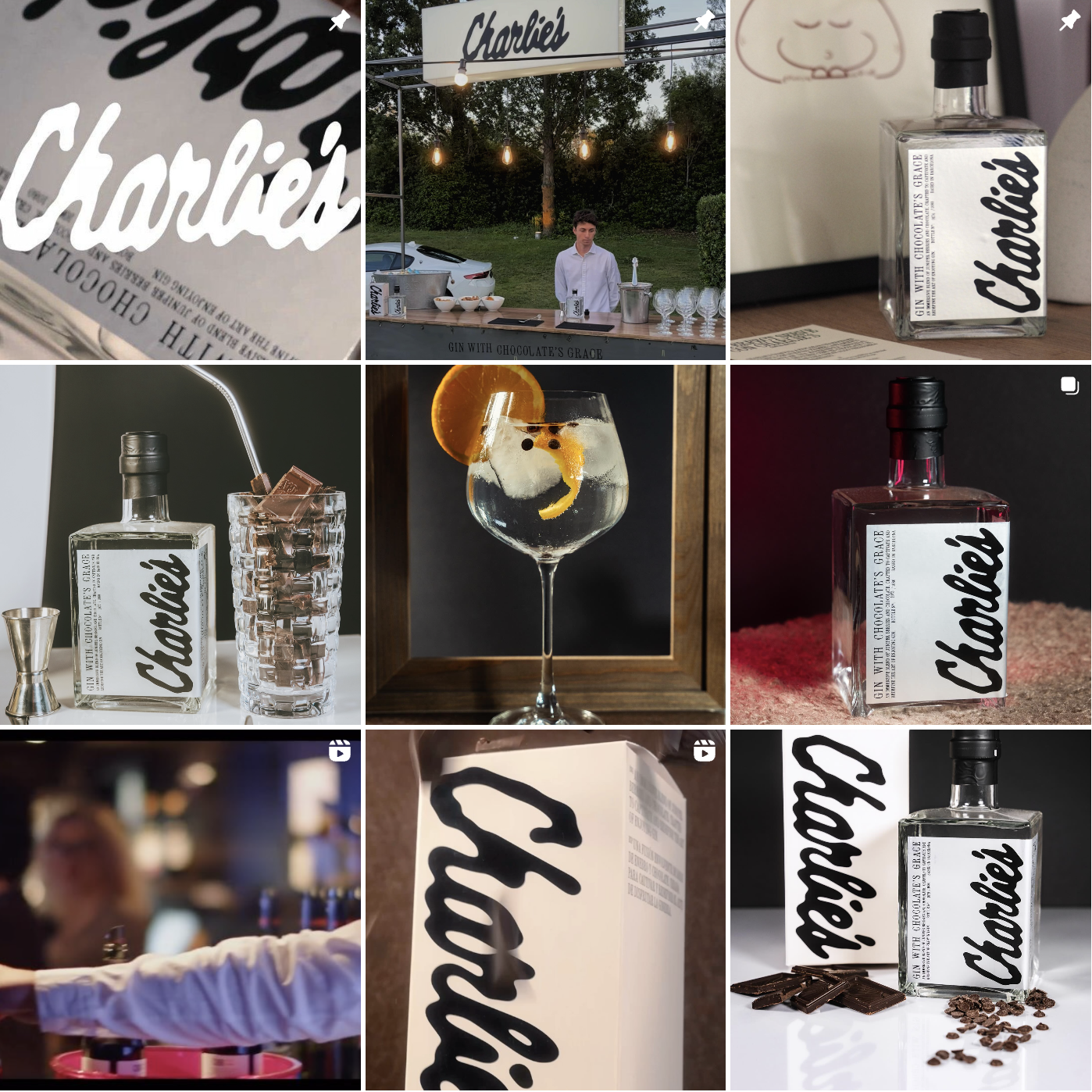
A premium gin with chocolate notes.
The website is super cool too, with a left and right scroll. Check it out here.
Although I rarely drink these days, the branding alone has me running to skyscanner to book a flight back to Barcelona; where the brand is based. I love everything here, the font choices, the art direction, the white and black pack and the logo. Right now I am all over thes logos where there’s a roughness that feels undesigned but lol we all know that’s not true.
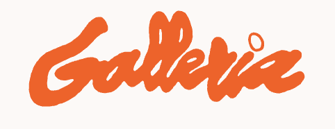
It’s verrrry similar to this place in Leeds that I also adore, Galleria.
Where the vibes are immaculate and I feel 100x cooler having being allowed in to drink their boujie tapwater. On closer look, the branding of these two is SO SIMILAR! It almost feels like the same designer created those logos, don’t you think!?
Which, usually, I’d hate… but since these are neighbour categories and obviously these two brands share similar customer vibes, honestly, I’m here for it. I think this is the best way to speak to the hands, hearts and minds of your fan base. Get to know what they love *outside* of your category and lean into the inspiration there, rather than within.
Who knows whether there was some inspo here? Or whether it’s simply the collective designer consciousness at play. Let me know what you think. For regular emails just like this, join my Out Of This World newsletter, where I’ll share cool design, thoughts and otherworldly visuals to shake up your personal algorithm.
")
